Oria
Type
Product
Brand
Industry
Energy
What we did
UX/UI design Brand identity Motion design
Oria is about a better way to power your life, inspired by the sun and what it means to feel at home. A fictional solar energy brand we designed to explore what an integrated solar company could look and feel like. One that handles installation, hardware, and software under one roof. Designed around the simple idea that energy should fade into the background, so you can focus on everything else. Effortless to use, and easy to forget it’s even there.
Warm tones, natural textures, and the quiet confidence of a system that just works.
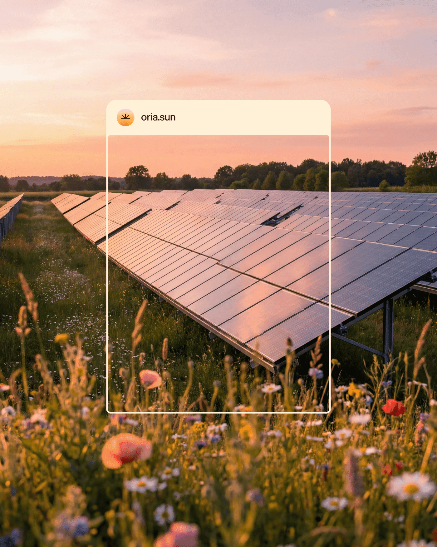
The visual identity draws from rays of sunlight, the colors of a sunrise and sunset, and the way the sky shifts throughout the day. Rounded shapes, smooth gradients, and motion that moves the way a sky does when the sun is setting.
We wanted Oria to feel like something you’d actually want in your home. Warm and approachable, the kind of brand that makes clean energy feel less like infrastructure and more like a natural part of life.
The Oria One battery sits at the heart of the system, storing the energy you generate for when you need it most. It comes in five colors inspired by nature, designed to blend into your garden, but nice enough to notice. The softer shapes and natural tones make it a device that earns its place in your home.
Where the brand meets the product
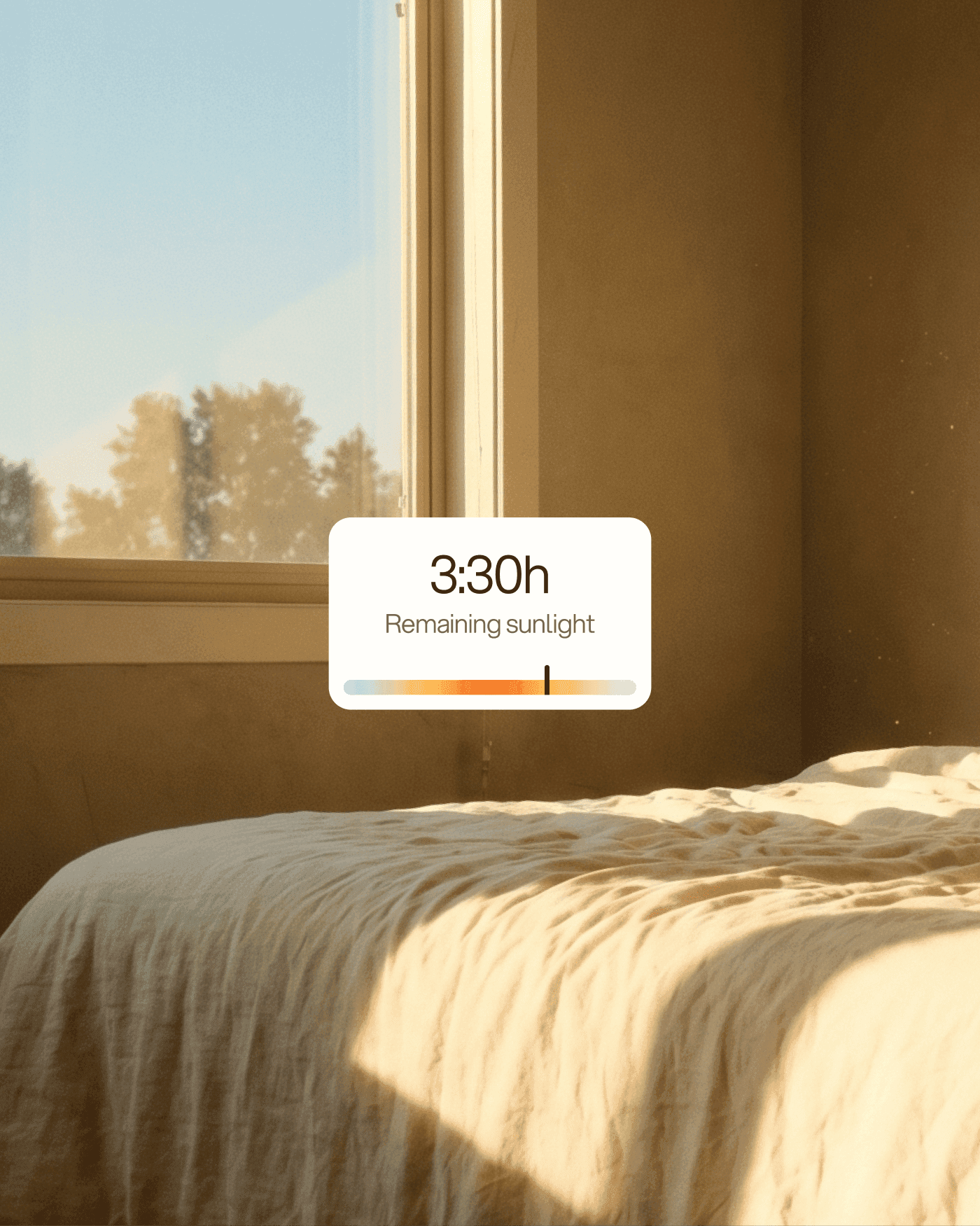
From the first encounter with the brand when you're requesting a quote to checking in on your system during a quiet morning, we designed every part of the experience to feel like Oria. So your energy works even when you're not thinking about it.
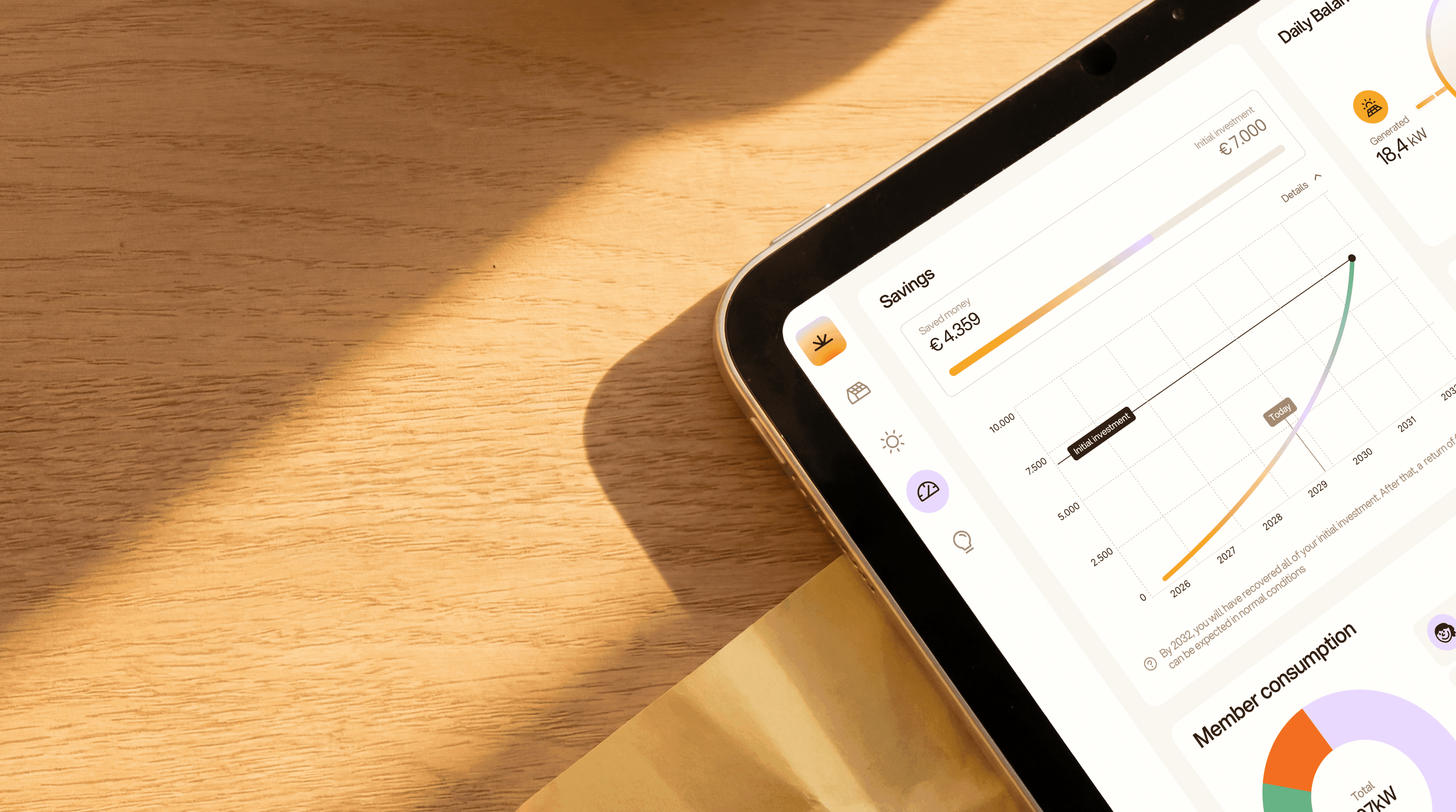
The Hub app brings it all together in a language anyone can understand. Less about kilowatts and technical readings, more about feeling in control of what your home is doing and how its energy is running.
Some materials in this project were created with the help of AI generation tools.

More projects we worked on